Karolina Moskal
  • Work
  • About
  • Fun
  • Contact
Selected work

Brand systems, campaigns, and everything in between.

A mix of real client work and self-directed concept projects — spanning brand identity, packaging, and go-to-market strategy.

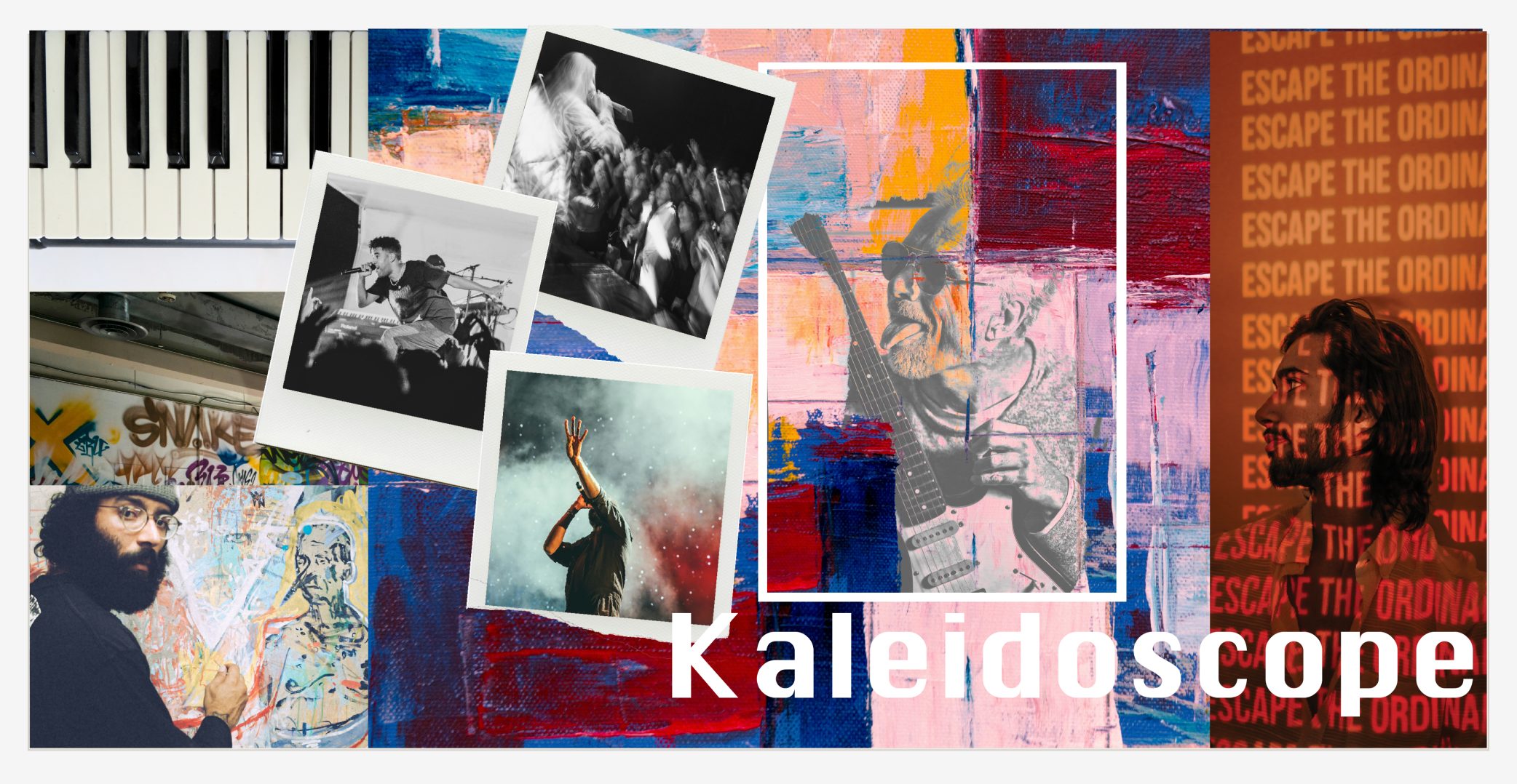
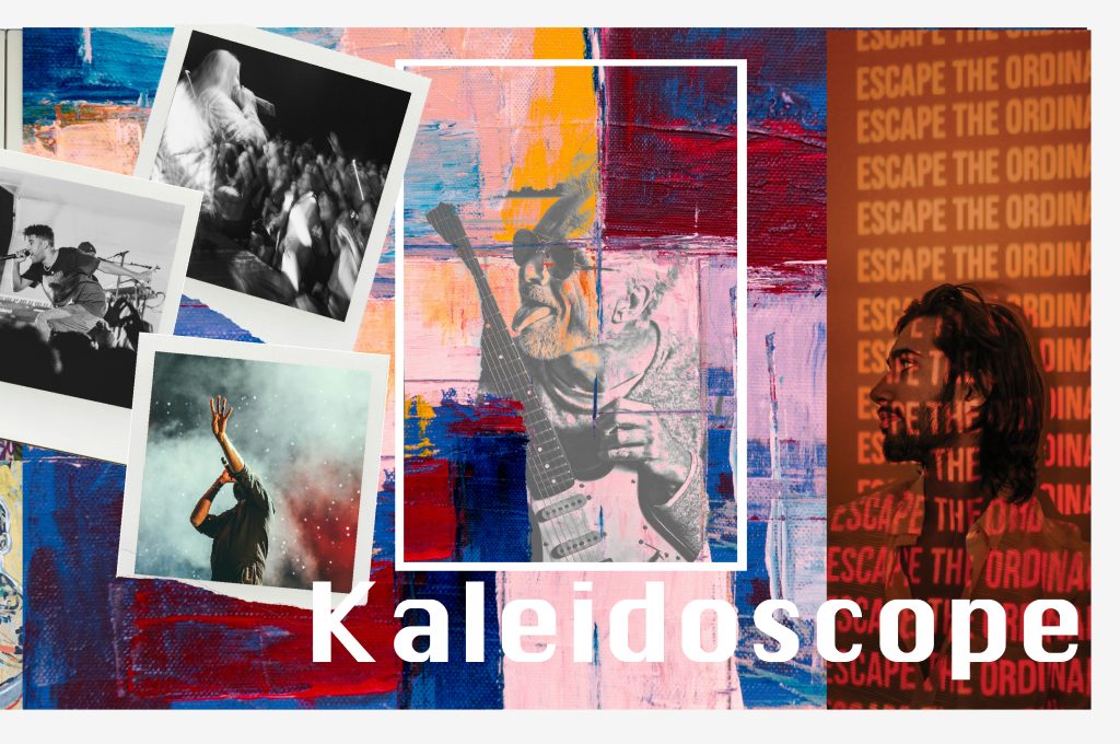
Kashmir Rolling Papers Kaleidoscope campaign collage of concert photos and street art
Brand IdentityPackaging
2021–2022 · Consumer Goods / Lifestyle

Kashmir Rolling Papers

A full brand identity and campaign system built at the intersection of art, culture, and creative freedom and extended into a produced cones packaging line.

View case study →
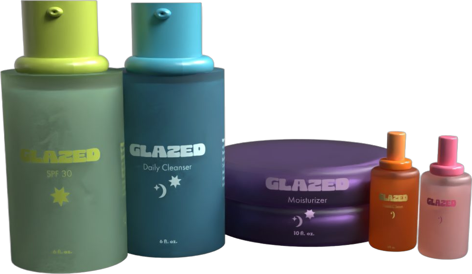
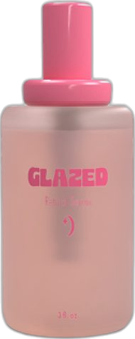
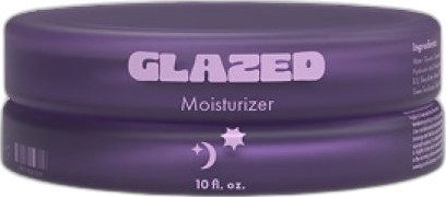
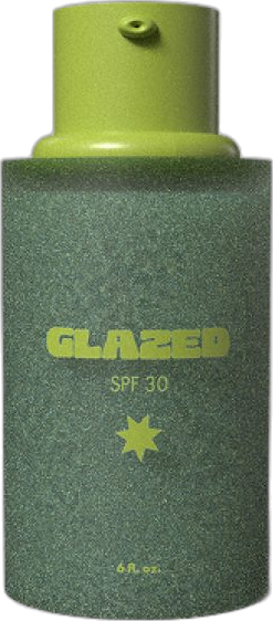
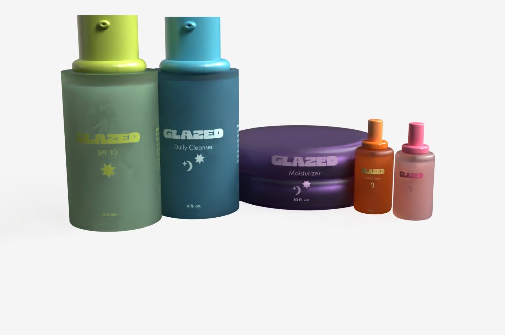
Glazed Skincare product lineup rendered in 3D: cleanser bottles, jars and serums
Brand IdentityConceptProduct Design
2025 · Clean Beauty / Wellness

Glazed Skincare

A concept skincare brand built from scratch — identity, 3D product renders, packaging, and a full go-to-market strategy for a 5-step routine.

View case study →
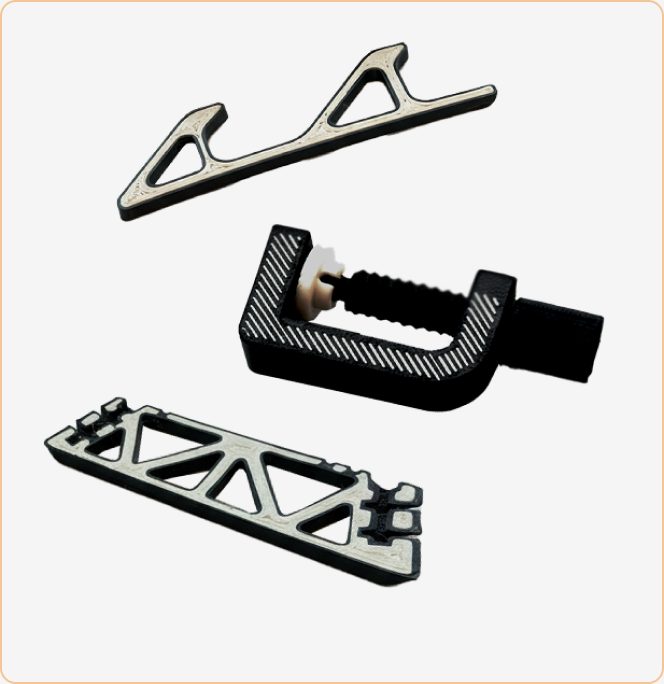
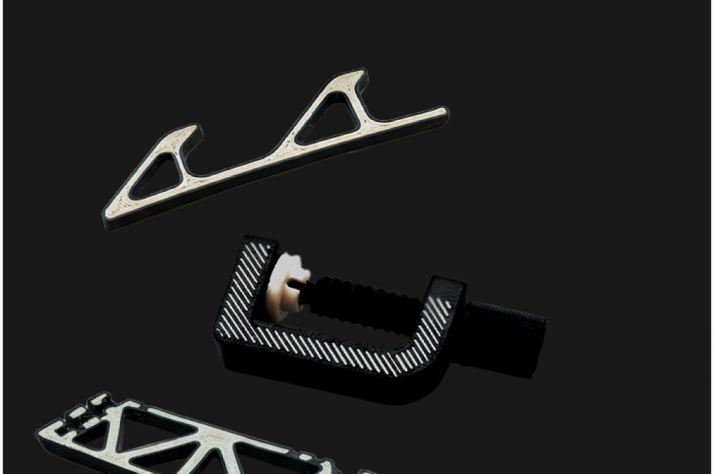
Tullomer 3D printed parts on black: bracket, clamp and lattice part
Product LaunchWebsiteMarketing
2023–Present · 3D Printing / Advanced Materials

Zpolymer — Tullomer MMP

Positioned and launched Multi-Material Printing for a breakthrough super-polymer — product positioning, landing page, and launch campaign, built solo.

View case study →

I started out with a graphic design degree because I loved making things — logos, layouts, packaging, anything with a grid and a good color palette. What I didn't expect was how quickly "make it look good" turned into "make it work." Every design decision I made kept running into the same question: does this actually connect with the person it's for?

That question is what pulled me out of pure design and into marketing. I wanted to be in the room where the strategy got decided, not just handed a brief after the fact. So I went looking for it — taking on more campaign work, more positioning, more full-funnel ownership — until the design skills I'd built became one tool in a much bigger kit.

"Design got me in the door. Understanding why it works is what got me the seat at the table."

Today I work as a Marketing Operations Lead, but I still think like a designer — obsessive about the details, protective of the brand, and genuinely happiest when strategy and craft are working together instead of fighting each other.

  1. 2017–2019

    Graphic Design Degree

    Where it started — College of DuPage (A.A.S. Graphic Design). Built the visual foundation: identity systems, packaging, layout, art direction.

  2. 2019–2022

    Brand & Design Roles

    Took on more strategic ownership — brand identity, campaign direction, packaging systems for consumer brands.

  3. 2022–Now

    Marketing Operations Lead

    Now owning full-funnel strategy, campaigns, and brand systems end-to-end — with design still baked into everything I build.
Kashmir trade show booth with pink chairs and patterned walls
Glazed Skincare bottles and jars
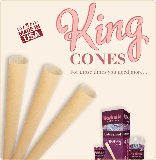
King Cones packaging ad for Kashmir
Tullomer printed parts
What I bring

Skills & Tools

Design & Brand

Figma · Brand Identity · Packaging · 3D Visualization · Adobe Suite

Marketing & Strategy

Campaign Strategy · Email & Life-cycle · Paid Media · GTM Planning · Event Planning & Logistics

Platforms & Ops

Google Ads · ActiveCampaign · Google Analytics · Google Merchant Center · Jira

AI & Automation

AI workflows for design · Clean, consistent product pages · Automated product-page pipeline (scrape → verify → build → SEO/AEO schema) · 16-block page component library

Outside of work

Things I Actually Enjoy

Drawing / doodlingBuilding a print-on-demand shopEndless Pinterest boardsConcerts & Music FestivalsTime In Nature

Want the full picture?

Take a look at my work, or grab a copy of my resume.

View My WorkView Resume (PDF)
Just for fun

Junk journal spreads and art.

This page is on the way: the stuff I make for myself, outside of client briefs.

Get in touch

Have a project in mind?

Tell me a bit about what you're working on — I'll get back to you within a couple of days.

Email
karolinamoskal56@gmail.com
LocationChicago, IL
Find meLinkedIn ↗
Brand IdentityPackagingMarketingB2B + B2C

Kashmir Rolling Papers

A rolling paper brand rooted in art, music, and culture. As in-house designer and marketer at Inter-Continental Trading, I designed Kashmir's marketing and creative: packaging for every new product, the brand guide, social content, and the tradeshow booth.

Role
Brand Designer · Art Director
Year
2021–2022
Deliverables
Brand Guide, Packaging, Social, Tradeshow Booth
Industry
Consumer Goods / Lifestyle
Kashmir Kaleidoscope campaign collage: concert photos, painted textures and street art
01

Brand Identity

Logo system Kashmir Rolling Papers wordmark on paisley

Bauhaus 93 wordmark in the pink-to-red gradient with a royal blue drop shadow, centered on the original paisley. Justus Bold carries the product name underneath.

Tone & voice

Confident · Poetic · Inclusive · Inspired

A creator at heart: expressive, curious, and culturally fluent. Moves between natural and artistic, timeless and contemporary.

Color palette

Kashmir red, a pink-to-red gradient for the wordmark, royal blue, cream, and 70% black, always set against the original paisley.

Typography Type specimen: Bauhaus 93 and Justus Bold

Bauhaus 93 for the Kashmir wordmark. Justus Bold for product names and all information on packaging.

The story behind Kashmir Rolling Papers goes deeper than the product itself. It begins with inspiration, passion, and expression — values that shape not only what we create, but why we create it. Kashmir was never meant to be just another rolling paper brand. It was born from the intersection of art, culture, and creative freedom, representing a kaleidoscope of voices and ideas across generations.
Expressive

Encourages individuality and creative freedom

Cultured

Rooted in art, music, and visual storytelling

Authentic

Honest materials, honest messaging

Art direction
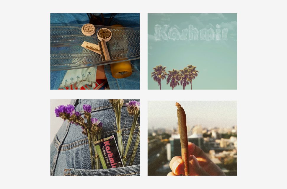
Moodboard: retro nostalgia with minimal composition
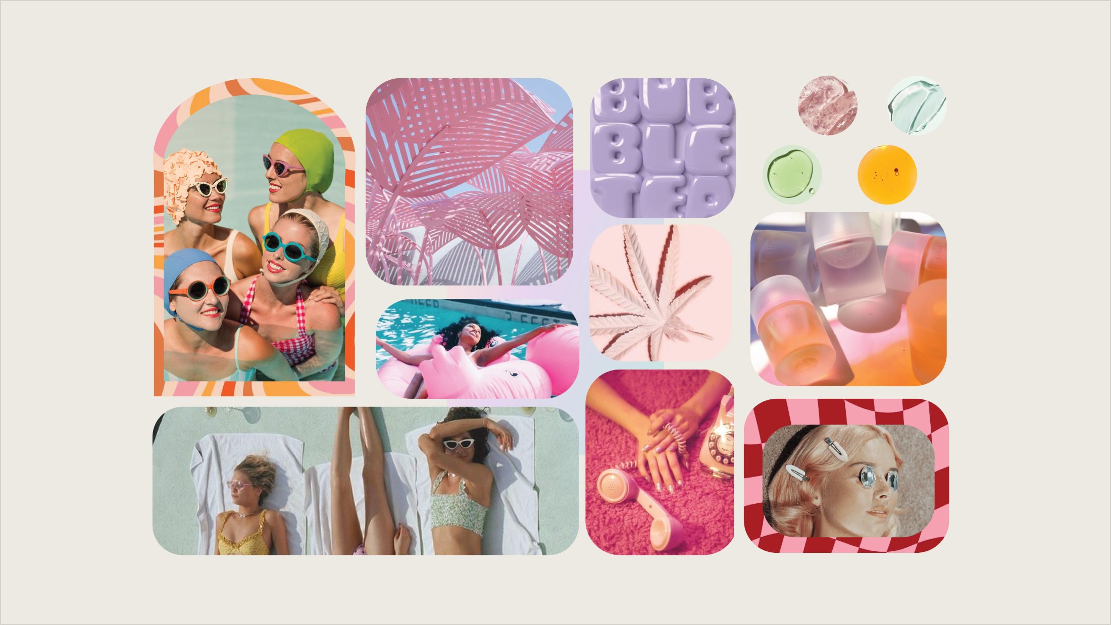
Psychedelic Nostalgia Meets Modern MinimalismRetro nostalgia should be balanced with modern, minimal composition, soft floral, sunset lighting, and vintage cues paired with clean layouts and negative space. This reinforces Kashmir's identity as a heritage-inspired brand that still feels contemporary and premium.
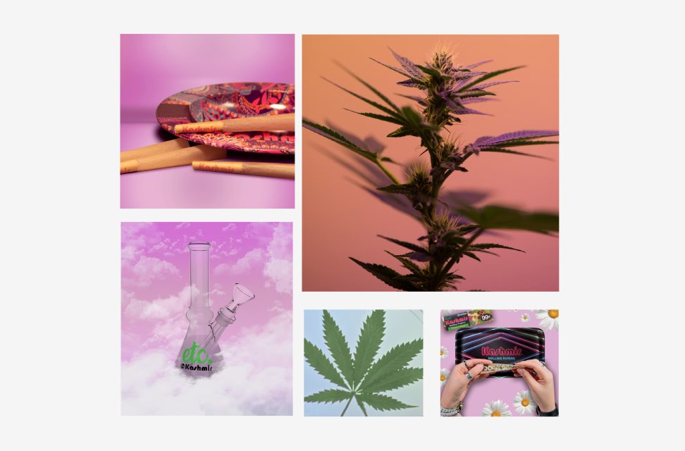
Moodboard: clouds, sky typography and golden-hour city views
Dreamlike Escapism & "Elevated Everyday" LifestyleImagery should place the product within dreamy, aspirational environments—cloud backdrops, sky typography, and golden-hour city views. This reinforces Kashmir's role in elevating everyday rituals into moments of escape and lifestyle expression.
Moodboard: pastels and warm sunlit tones
Color Story: Playful Pastels + Warm Sunlit TonesVisuals should combine playful pastels with warm, sunlit tones—pinks, greens, and lavender balanced with gold lighting and natural textures. This reinforces a brand mood that feels both whimsical and grounded.
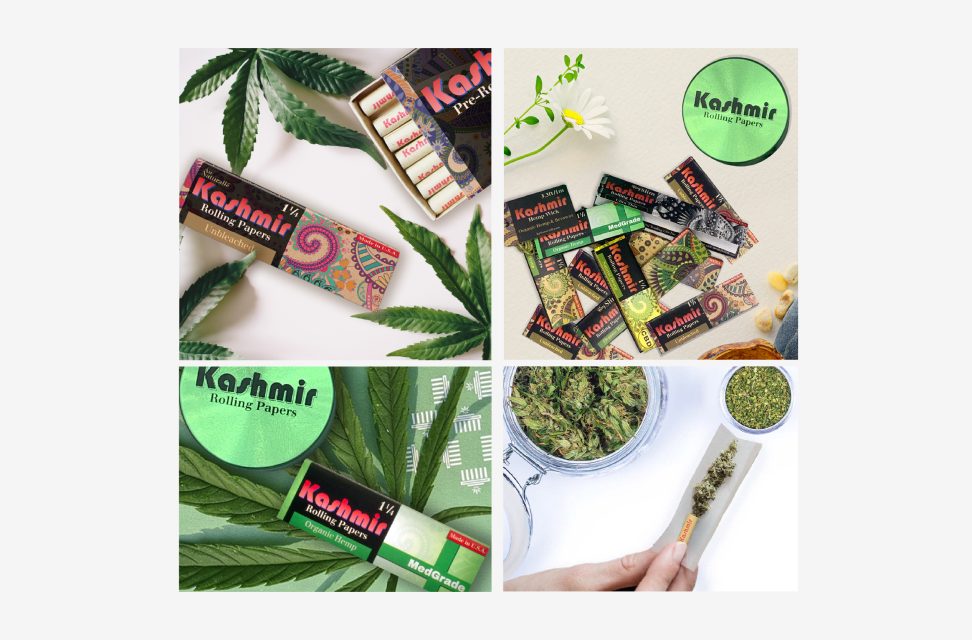
Moodboard: packaging flatlays and stylized product compositions
Product as Graphic ObjectProduct photography should treat packaging as a graphic element—flatlays, repetition, and stylized compositions that integrate photography with graphic design. This reinforces Kashmir's packaging as a core part of the brand's visual language.
02

Marketing & Campaign

B2B — Trade / Wholesale

Smoke shops & distributors

Retail buyers deciding what earns counter space. Packaging and the tradeshow booth had to make Kashmir stand out from a crowded wall of paper brands at a glance.

B2C — End Consumer

Playful, nostalgic, aspirational buyer

This Instagram-first audience responds to a cohesive brand world that feels playful, nostalgic, and aspirational — dreamy skies, warm sunlight, florals, and retro textures woven into everyday rituals and stylized flatlays.

IG

Instagram

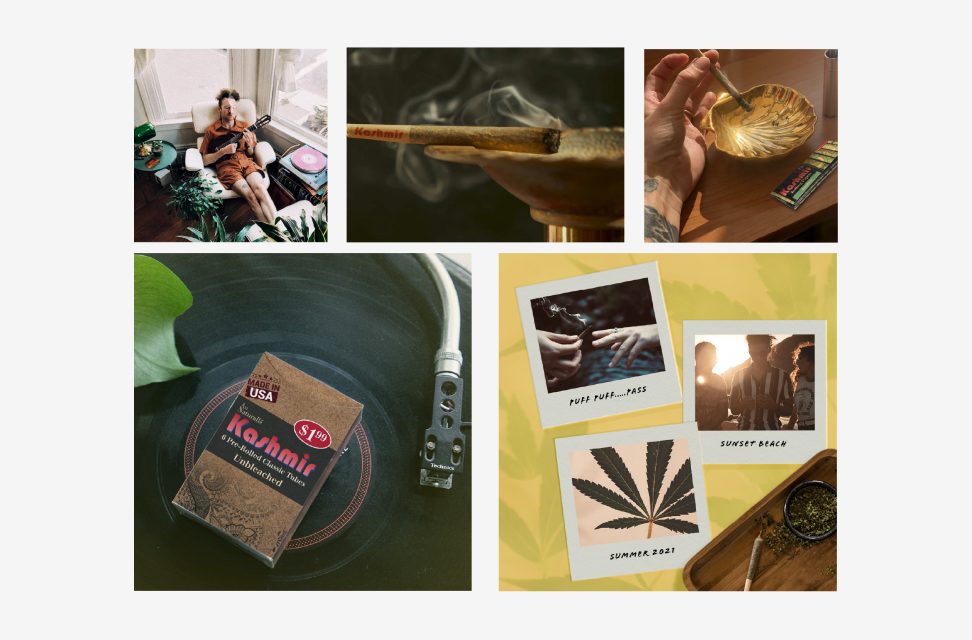
Lifestyle photography blended with graphic composition — dreamy skies, florals, and retro textures reinforcing Kashmir as a lifestyle brand rooted in creativity and escapism.

TK

Tradeshow / Experiential

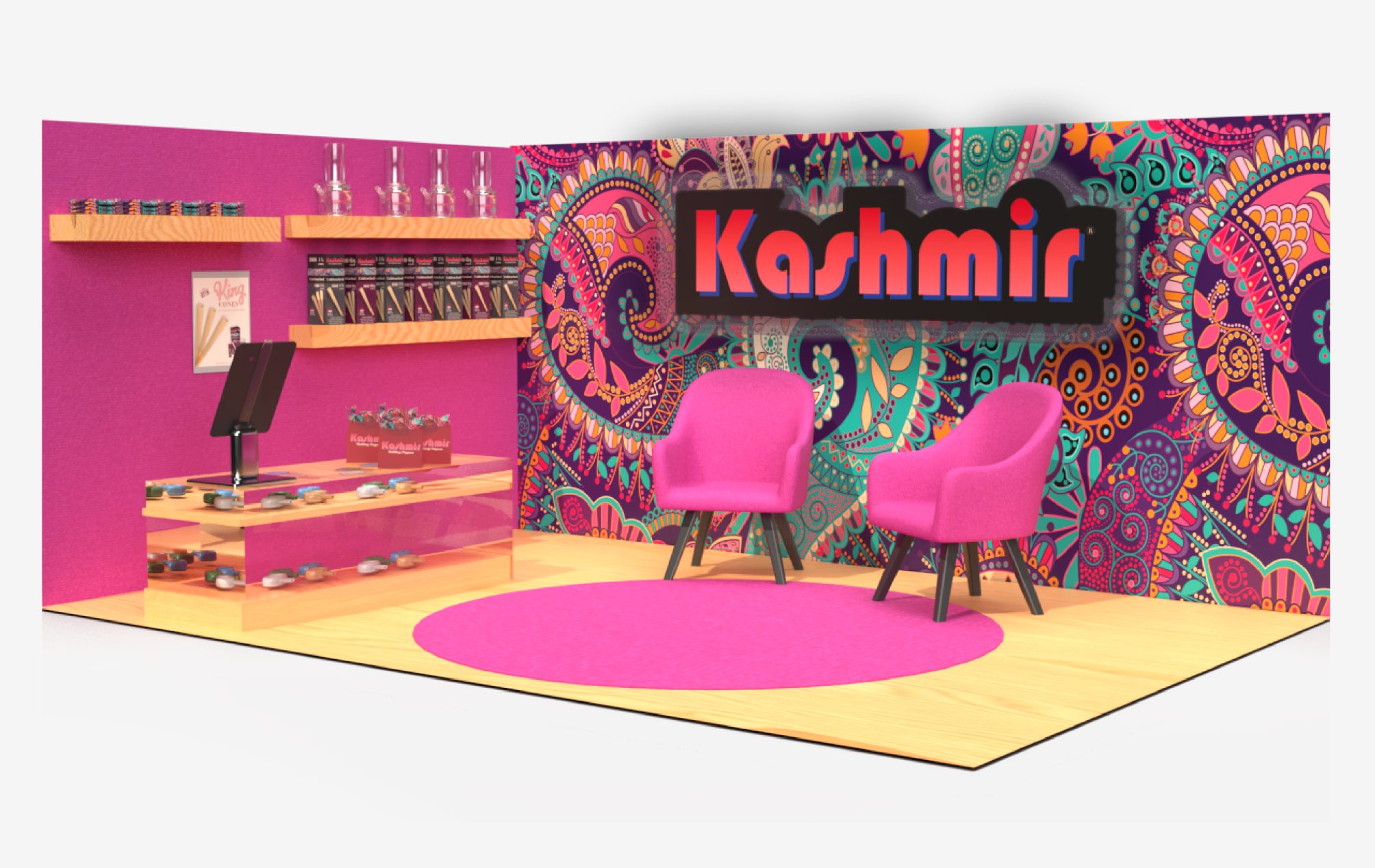
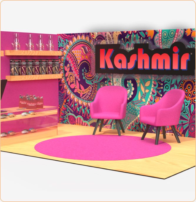
Bold paisley patterns, saturated pink tones, and warm wood textures create a vibrant, immersive retail space balancing product display with lounge-style seating.

Kashmir Instagram feed @kashmir.420 on a phone
Social media · @kashmir.420

This Instagram feed builds a cohesive brand world that feels playful, nostalgic, and aspirational. The content balances lifestyle photography with graphic composition, blending dreamy skies, warm sunlight, florals, and retro textures to create a soft counterculture aesthetic. Products are woven into everyday rituals and stylized flatlays, allowing the packaging to function as both subject and design element. Together, the grid communicates Kashmir as a lifestyle brand rooted in creativity, escapism, and elevated everyday moments.

Tradeshow booth
Kashmir tradeshow booth render: paisley walls, pink lounge chairs and product shelving

The tradeshow experience translates Kashmir's digital brand world into a fully immersive physical environment. Bold paisley patterns, saturated pink tones, and warm wood textures create a vibrant retail space that feels playful, inviting, and unmistakably on-brand. The layout balances product display with lounge-style seating, encouraging conversation, discovery, and hands-on interaction. This environment reinforces Kashmir as a lifestyle-driven brand, turning the booth into a colorful destination that attracts attention and creates memorable, shareable moments.

03

Packaging Design

King Cones launch print ad with three unbleached cones and packaging

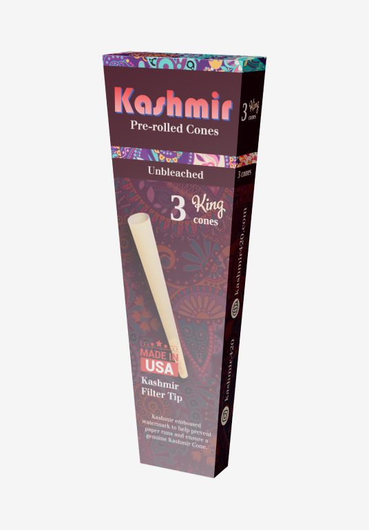
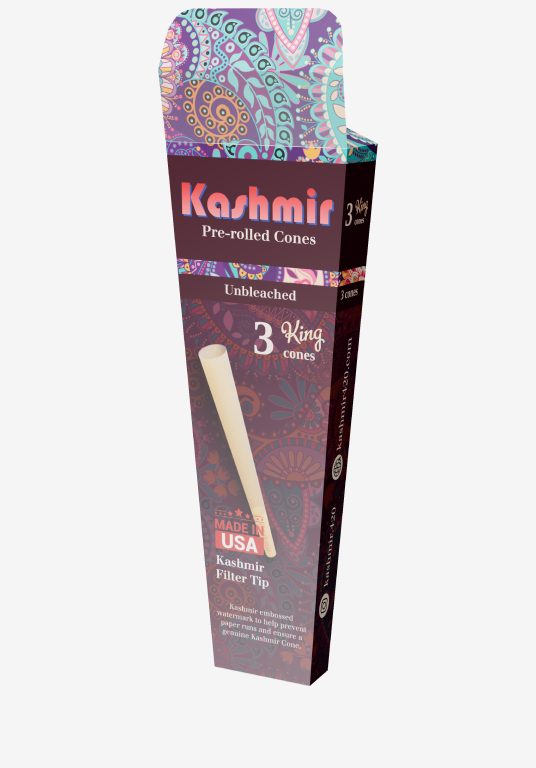
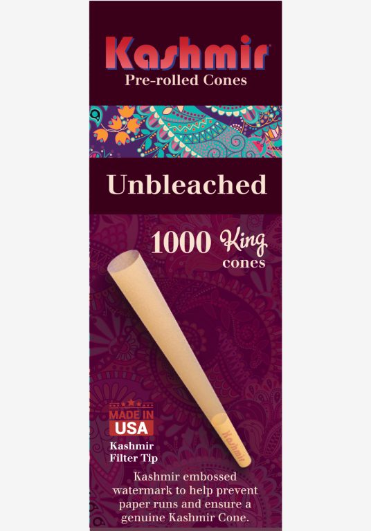
A three-size line of unbleached King cones: a 3-pack for the counter, a 50-count jar, and a 1000-count bulk box. One system ties them together: the wordmark on a deep plum band, a paisley stripe, and the cone itself front and center.

Format
3-pack tuck box · 50-count jar label · 1000-count bulk box
Print specs
CMYK, matte
Line
3 sizes, plus a launch print ad (2022)
Status
Produced · In market
3-pack King cones box, closed
3-pack King cones box, open
1000-count bulk box, front
04

Outcomes & Reflection

Every SKU

Packaging designed in-house for every new product launched while I was there.

1 booth

Tradeshow booth designed end to end: paisley wall graphics, product displays, lounge layout.

17.1K

Instagram followers on @kashmir.420, with content created and posted in-house.

Kashmir taught me to design a brand as a world, not just a logo. The same paisley, pinks, and retro warmth had to hold up on a tiny booklet, an Instagram grid, and a walk-in booth.
Next projectGlazed Skincare→
Brand IdentityPackagingMarketingConcept

Glazed
Skincare

A concept organic skincare brand built around a four-step routine for women 25–30 who want real results without a shelf full of products.

Role
Brand Designer · Creative Director · GTM Strategy
Year
2025
Deliverables
Logo, Style Guide, Packaging, Campaign, Ingredient Research
Industry
Clean Beauty / Wellness
Glazed brand moodboard: retro pastel textures, skincare and 70s California references
01

Brand Identity

Logo system Glazed wordmark

The wordmark

Color palette

A pastel-forward palette with a mustard accent — soft enough to feel skincare-safe, bold enough to read on a shelf. Each product SKU draws from a distinct hue in the family.

Typography & icons Glazed type sheet: the hand-lettered GLAZED wordmark over each product name, Futura PT Bold and Futura PT Book character sets, and the moon and sun icons for night and day routines

A hand-lettered wordmark leads every label, with Futura PT Bold for headings and Futura PT Book for product names and body copy. A moon and a sun mark which products belong to the night and day routines.

Brand story & pillars

Glazed was built on a simple premise: most women in their mid-to-late twenties don't need a 12-step system, they need 5 products that actually work. The brand lives at the intersection of clean-beauty rigor and genuine ease, targeting early-career women who are ingredient-literate, Eco-conscious, and deeply tired of over complicated routines. Aesthetically, Glazed pulls from retro optimism the palette and typography nod to 70s California without trying to replicate it entirely.

Simplicity

Four products, one routine — skincare that fits in a carry-on and never makes you feel behind. Complexity is not a proxy for efficacy.

Transparency

Every ingredient is listed, explained, and sourced with intention. No filler, no mystery — just clean formulas with nothing to hide.

Natural Beauty

Glazed enhances your skin's baseline, it doesn't mask it. The goal is a face that looks effortlessly healthy, not treated.

Sustainability

Recyclable packaging, ethically sourced organic ingredients, and a conscious commitment to producing less — fewer SKUs made better.

02

Marketing & Campaign

Launch Strategy — Pre-launch

Building anticipation before day one

Teasers, behind-the-scenes ingredient content, and an email early-access list, designed to give the brand a community before it had a product page. Influencer partnerships seeded within wellness, clean beauty, and minimalist lifestyle niches.

B2C — End Consumer

Women 25–30, ingredient-conscious, low-maintenance

Urban and suburban professionals who've done the skincare research and are ready to simplify. They read ingredient lists, follow clean-beauty accounts, and want a routine that looks as good on the shelf as it performs on their skin.

IG

Instagram

Primary content platform, product flat lays, lifestyle shots, ingredient education carousels, and before/after skin content. Content pillars: "what's in it," "how to use it," and "your skin, just better."

TK

TikTok

Short-form video showing the four-step routine in real time, relatable, unfiltered, and fast. Emphasis on ingredient transparency videos and "get ready with me" formats targeting the 25–30 demo.

✉

Email & Retargeting

Early-access email list with exclusive launch discounts. Post-launch re targeting ads on Meta targeting site visitors who didn't convert, focused on the routine's simplicity and ingredient story.

Branding
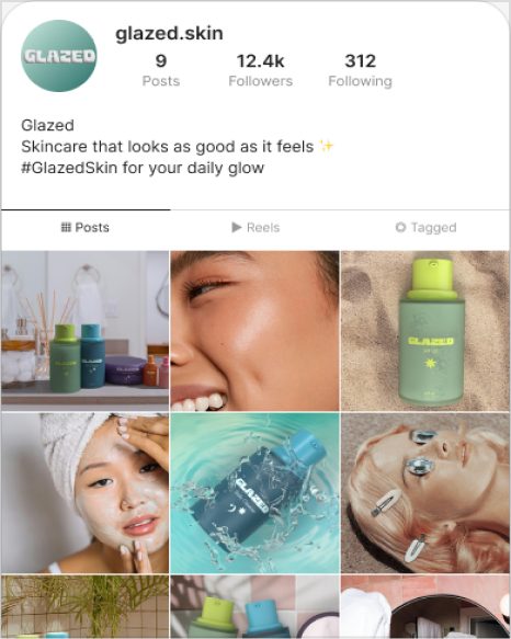
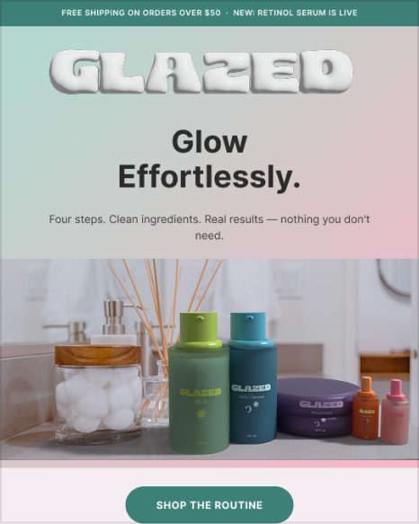
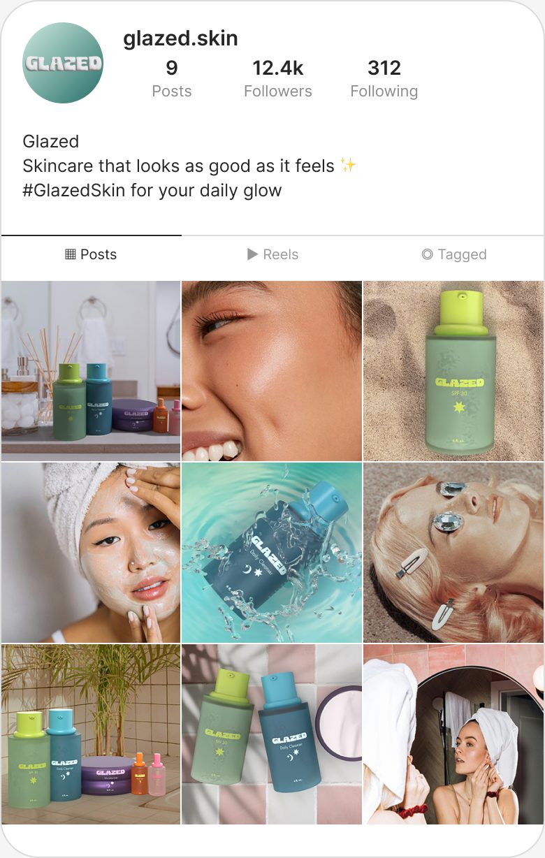
Glazed Instagram profile gridBrand IG grid → Glazed launch emailEmail template →
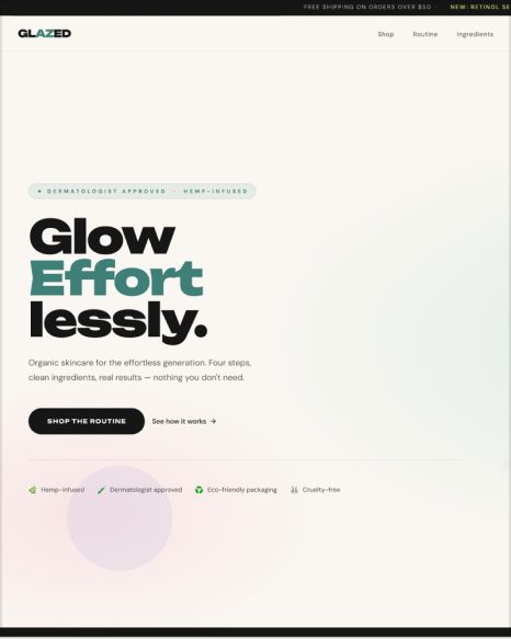
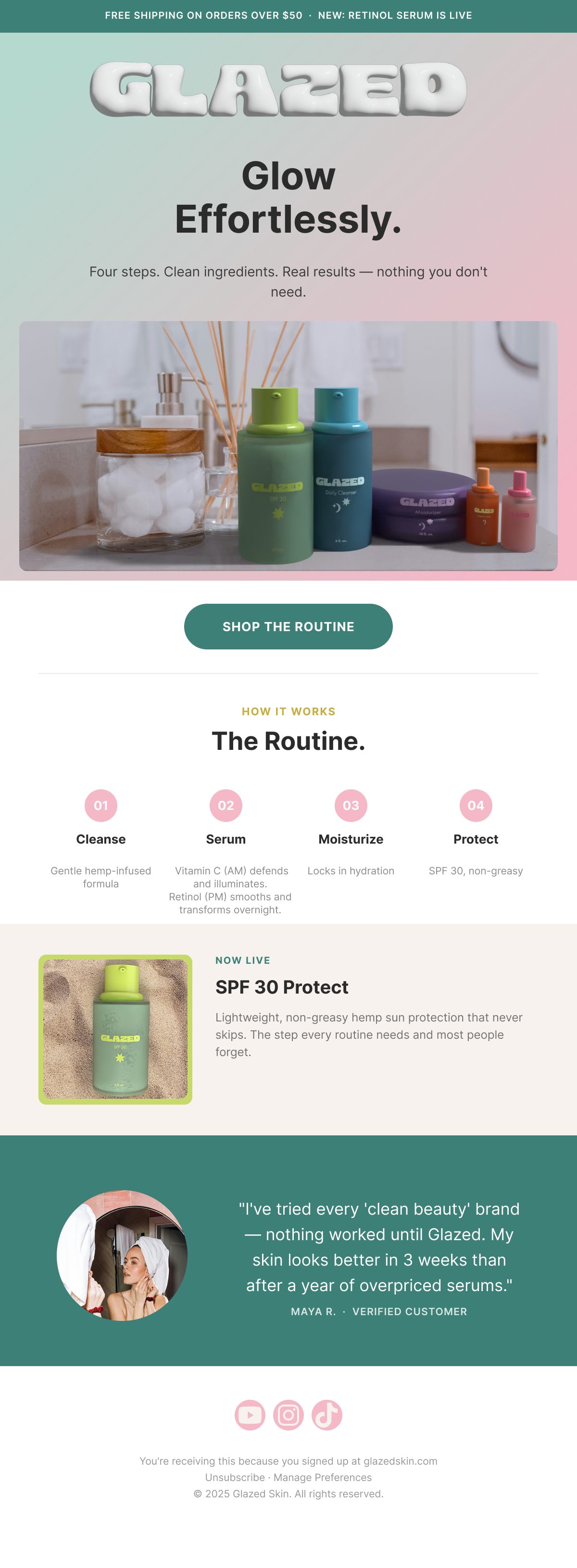
Glazed landing page: Glow EffortlesslyLanding page
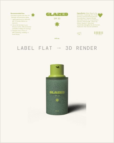
SPF 30 label flat turned into a 3D renderLabel flats →
03

Packaging Design

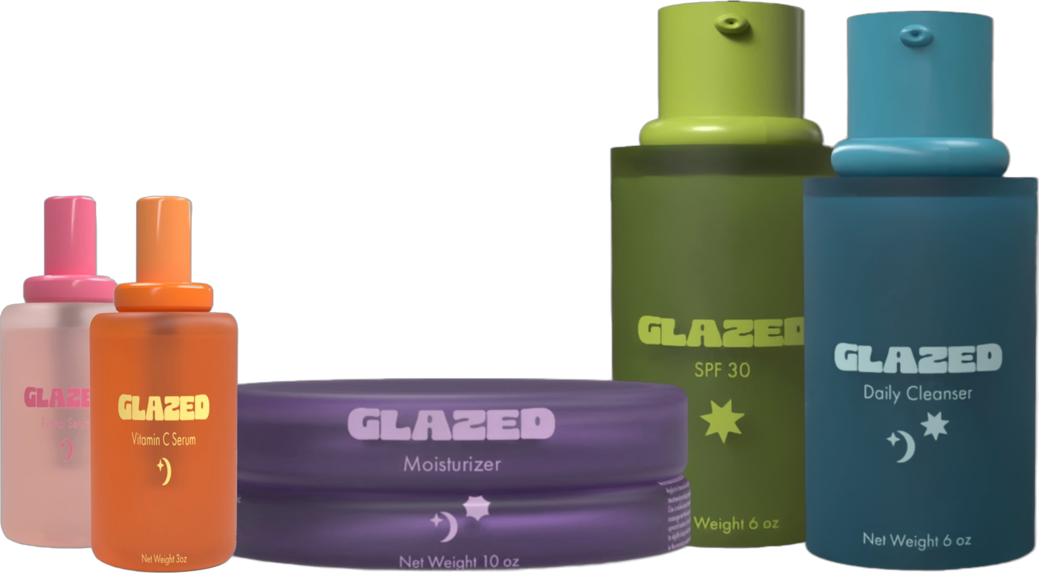
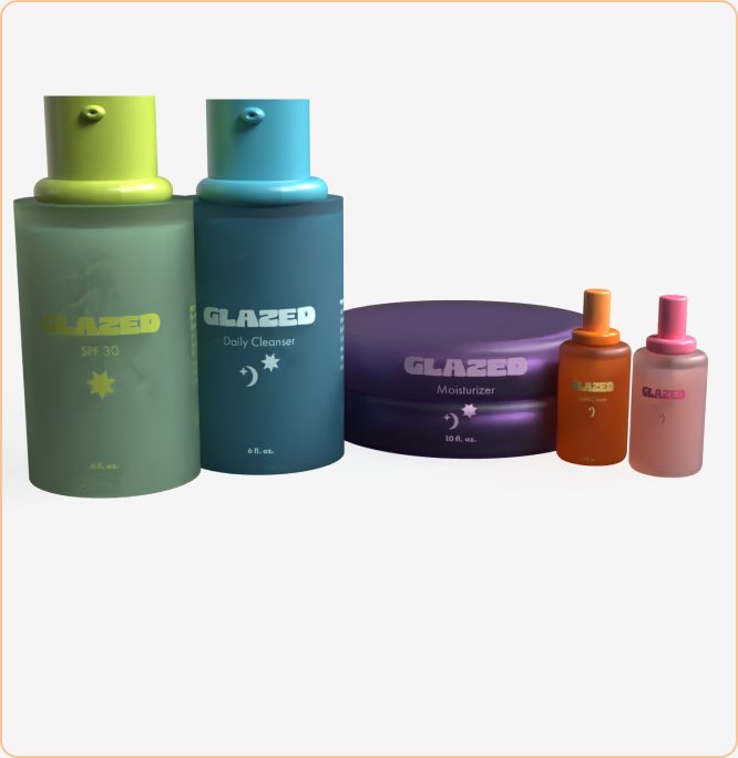
Full Glazed lineup: cleanser, serums, moisturizer and SPF
Format
Glass dropper · Pump bottle · Tub
Materials
Recyclable glass
SKUs designed
5 products across the core routine, labeled with day & night routine Icons
Status
Concept — mockups complete
Full SKU lineup: Cleanser · Vitamin C Serum · Retinol Serum · Moisturizer · SPF 30

Each SKU in the Glazed line is color-coded to its product step — a soft pastel system that makes the four-step routine intuitive at a glance. Typography is minimal and ingredient-forward: the full INCI list runs down the side panel, readable and unabbreviated. Packaging is sized for carry-on travel. The retro-influenced label design uses rounded serif headers against clean white grounds, nodding to vintage apothecary without the antiquated baggage.

Key ingredients featured on pack
BakuchiolRosehip Seed OilTetrahexyldecyl AscorbateNiacinamideZinc Oxide SPFHyaluronic AcidCeramidesSea Buckthorn OilGreen Tea Extract
Full Glazed lineup: Retinol Serum, Vitamin C Serum, Moisturizer, SPF 30 and Daily Cleanser
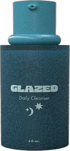
Glazed Daily Cleanser render
Cleanser
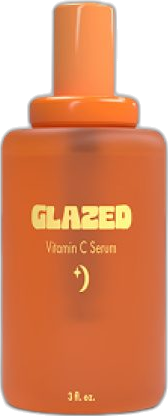
Vitamin C Serum render
Vitamin C
Retinol Serum render
Retinol
Moisturizer render
Moisturizer
SPF 30 render
SPF 30
04

Outcomes & Reflection

5

Fully formulated SKUs — from ingredient research through final packaging mock ups, concept to completion

Full

End-to-end brand system delivered: positioning, identity, ingredients, packaging, and a launch campaign strategy

100%

Natural, cruelty-free ingredient formulations, every product developed with a clean, research-backed ingredient list

Glazed pushed me to think like a founder, not just a designer. Researching the actual ingredients and understanding why bakuchiol outperforms synthetic retinol for this audience, or how to stabilize Vitamin C in an oil-based serum this made every design decision feel earned. The constraint of five products, one routine, no filler translated directly into the visual language: nothing on the packaging is decorative, everything is informational or intentional.
Next projectZpolymer — Tullomer MMP→
← Back to Glazed case study

Brand IG Grid

Glazed Instagram grid shown on a phone
← Back to Glazed case study

Brand Email Template

Glazed launch email template, full length
← Back to Glazed case study

Label Flats

Each label flat is designed on its bottle color, then wrapped onto the 3D render.

Daily Cleanser label flat and render Retinol Serum label flat and render Vitamin C Serum label flat and render SPF 30 label flat and render Moisturizer label flat and render
Full-Funnel MarketingWebsiteProduct LaunchClient Work

Zpolymer — Tullomer MMP

Positioning and launching Multi-Material Printing (MMP): a way to get composite-grade strength on a standard dual-nozzle desktop printer, without needing a full industrial high-temp machine.

Role
Sole Marketing Owner — Strategy Through Execution
Timeframe
2023 – Present
Deliverables
Landing Page, Product Positioning, Launch Campaign
Industry
3D Printing / Advanced Materials
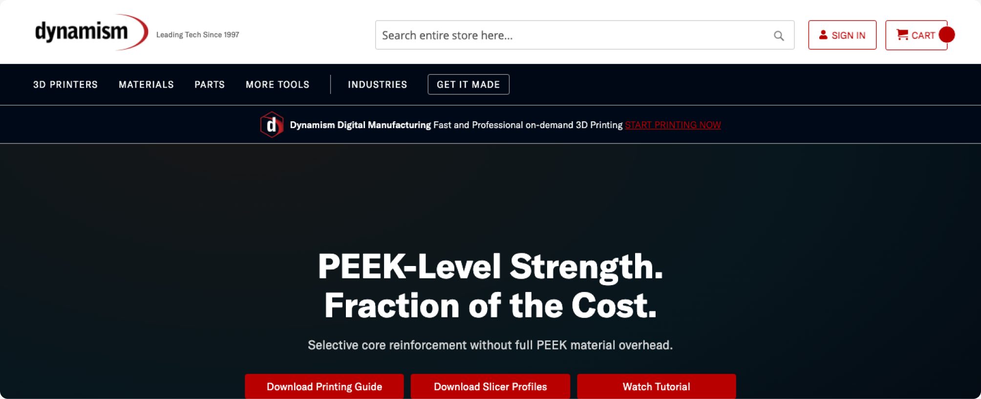
Tullomer MMP landing page hero: PEEK-Level Strength. Fraction of the Cost.
01

The Challenge

The problem

Tullomer is a breakthrough super-polymer — pure polymer, no fillers, matching the strength of continuous-fiber materials like carbon, Kevlar, and glass, at up to 6x the strength of steel at 1/6th the weight. But printing it at full performance requires a high-temperature industrial machine (300°C+ nozzle, heated chamber) that most makers and even many professionals don't have access to.

The solution — MMP

Multi-Material Printing solves this by blending just 10–20% Tullomer into a base material in situ, on any dual-nozzle desktop printer capable of 300°C. That composite mix can outperform incumbent engineering materials like PEEK and Ultem — turning a standard desktop printer into what is effectively a composite manufacturing system, without the industrial machine price tag.

Why it matters

This was fundamentally a user-experience problem before it was a marketing problem: the material's real performance was locked behind hardware most buyers didn't own. MMP reframes the story from "buy an industrial printer" to "get PEEK-level performance for less, on hardware you may already have."

02

Marketing & Positioning

B2B — Engineers & Manufacturers

"Get PEEK performance for less"

Positioned Tullomer/MMP as a direct replacement for aluminum, steel, magnesium, PEEK, PEKK, PAEK, Ultem, and nylon carbon-fiber — speaking to engineers evaluating real material specs, not just marketing claims.

Prosumer — Desktop Printer Owners

"Turn your desktop printer into a composite manufacturing system"

Framed MMP around accessibility — Bambu Lab and Ultimaker owners could unlock composite-grade parts without buying industrial equipment, using selective reinforcement and dual-material workflows they already had.

S

Strategy

Reframed the launch around accessibility and UX rather than raw material specs — the real barrier to adoption was hardware, not performance.

W

Landing Page

Built the full MMP launch page — positioning, feature breakdown, and design/printing guide — end-to-end.

C

Campaign

Drove traffic via homepage banner placement and campaign tracking (utm_campaign=zpolymersmmp) with no team to hand off execution to.

03

Landing Page Build

Built solo — from positioning through to the published page — covering the full story a technical buyer needs before purchasing.

Landing page section: composites built from within Landing page section: reinforcement benchmark data Landing page section: beam interlocking reinforcement Landing page section: printing guide and engineering applications
04

Outcomes & Reflection

First-to-market positioning

Helped bring Tullomer to North America through Dynamism, positioning MMP as the accessible on-ramp to composite-grade printing.

Reframed the barrier

Shifted the story from "buy industrial equipment" to "get PEEK performance for less" — solving the real adoption blocker.

Solo, end-to-end delivery

Positioning, landing page, and campaign built and shipped without a team to divide the work across.

This project was as much a UX problem as a marketing one — the material's real value was locked behind hardware most buyers didn't have. Reframing MMP around what people could already do with their existing printer, instead of what they'd need to buy, was the unlock. It's a good reminder that sometimes the biggest marketing lever isn't a better headline — it's understanding exactly where the friction actually lives for the buyer.
Next projectKashmir Rolling Papers→
© 2026 Karolina Moskal — Portfolio